EpicDiamondX Logo History
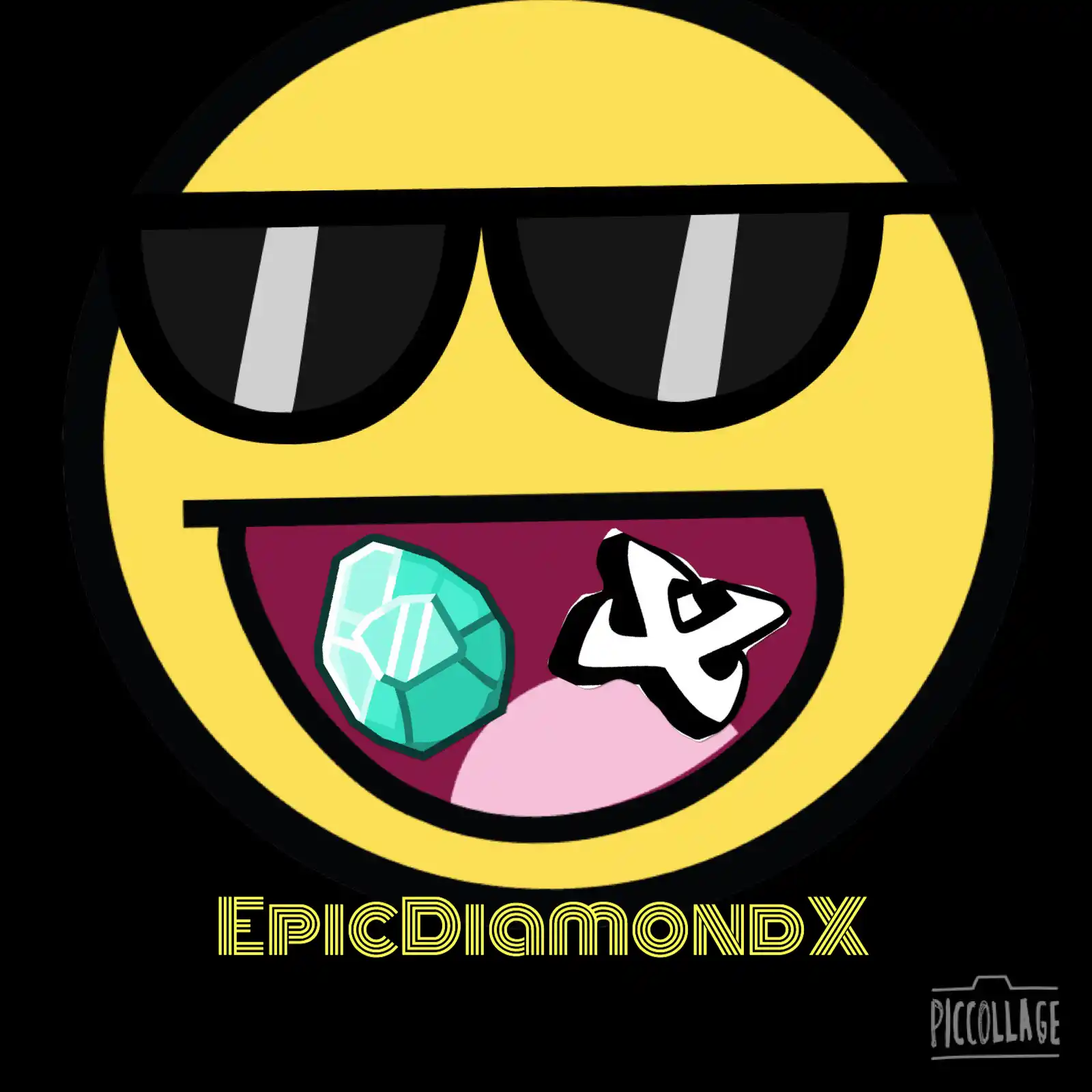
Profile Pic #1
(Jan. 2016)
The first logo for EpicDiamondX — which consists of the Epic Face, a Minecraft diamond, and a clip-art of the letter X. Definetely something a 13yo would make.
Profile Pic #2
(May. 2016)
Slight revision; increased brightness and changed font — didn't really last long.
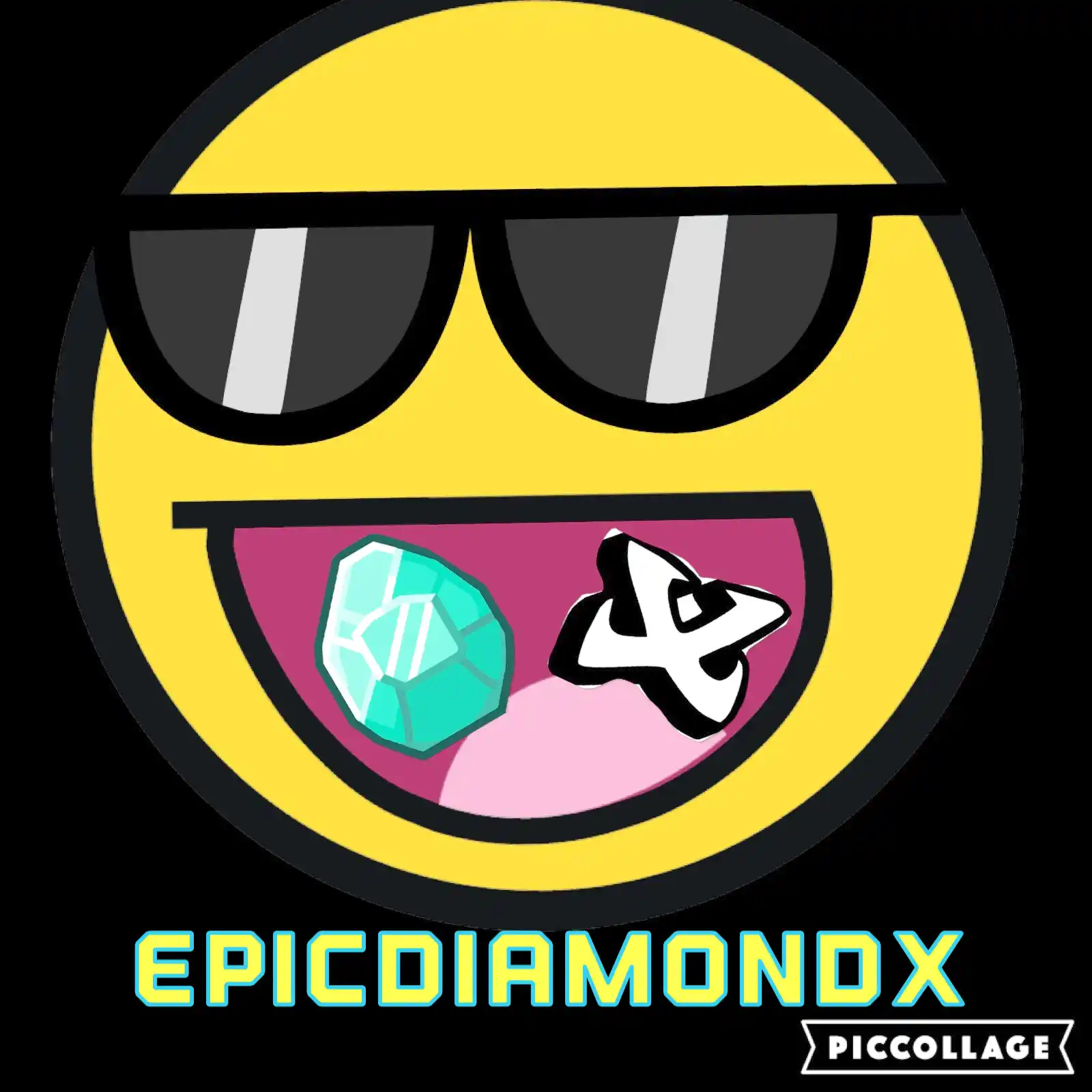
Profile Pic #3
(June. 2016)
Adjusted size, brightness and a new font. The X is different and the watermark is cropped out.
Profile Pic #4
(~2017)
First major revision; bevel effect on logo and text, added background.

Profile Pic #5
(2017)
Adjusted logo and text, background is more vibrant and the font from #3 returns.
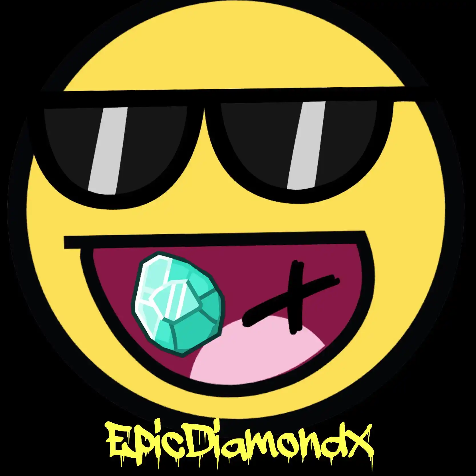
Unused Profile Pic #6
(Dec. 2017)
Increased logo and text size, background and text is linear-gradient. The diamond is now different.
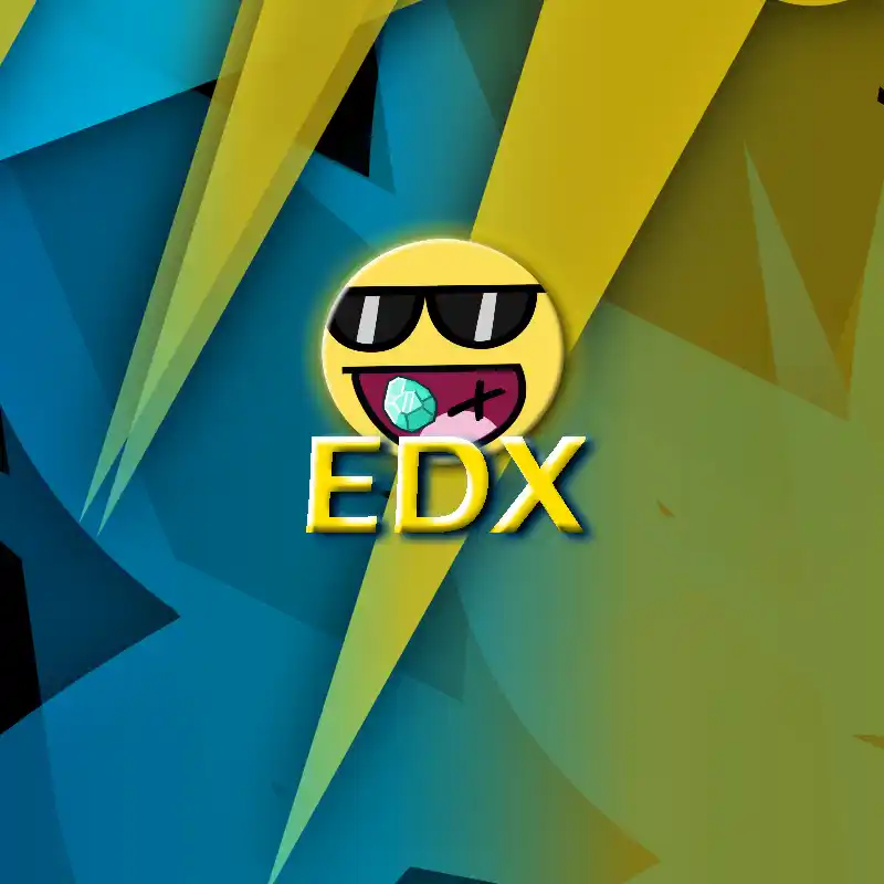
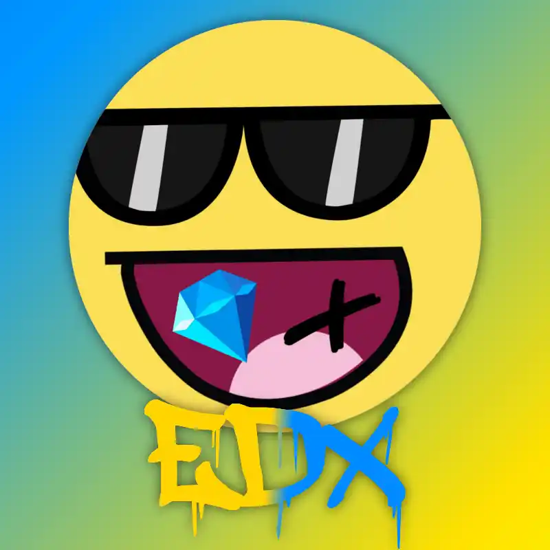
Profile Pic #6
(Jan. 2018)
Based on the unused #6, the text is stylized to appear gritty and have depth. The background has more compositional elements and features the Roblox character of EpicDiamondX.
Profile Pic #7
(Oct. 2019)
Logo rebrand — an original vector design. It removes the visual representations of its name and now has blue eyes with highlights and cheek blushes. Ngl, this took some time getting used to lol.

Unused Profile Pic #7 (Alt)
(Oct. 2019)
Was meant to be used for music platforms. Depicts a vinyl record with headphones on top.

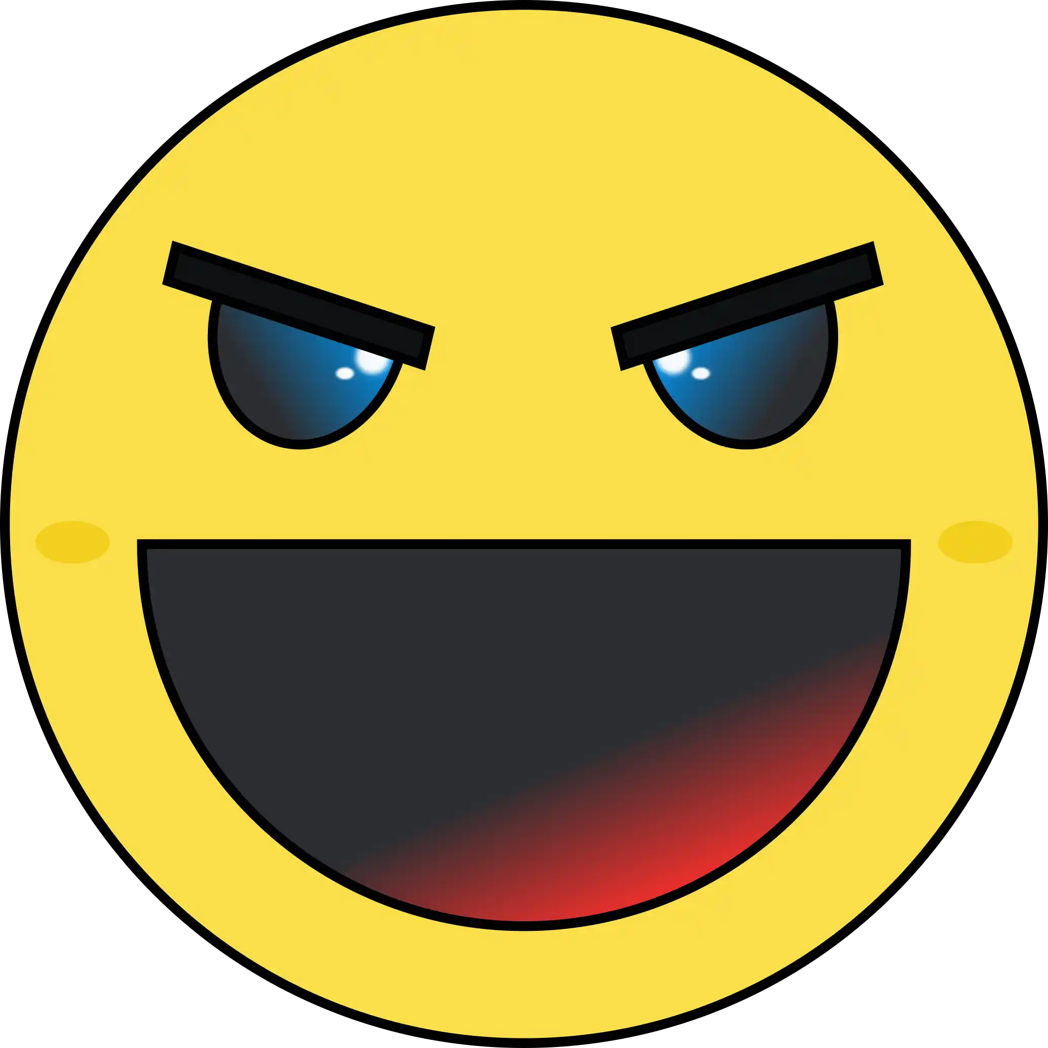
Profile Pic #7.1
(Dec. 2020)
First revision of rebrand; darkened greys and adjusted blue and red gradients for more vibrancy. The blush is more orange and blurred.
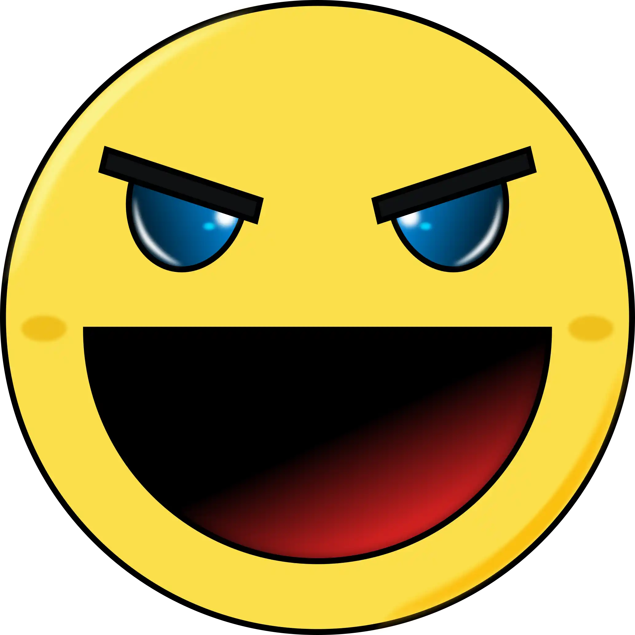
Profile Pic #7.2
(Apr. 2023/Current)
Added more complexion, such as highlights and shadows. Eye highlights are adjusted to pop more, and the logo overall creates a sense of depth.
REMiNiX Logo History

profile pic #1 (youtube)
(apr. 2020/current)
a still image from a flipnote. i just can't seem to let this picture go lol.
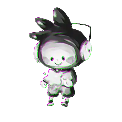
profile pic #2
(oct. 2020)
an artwork of maxwell from scribblenauts by larkismyname. the image is edited to black and white with chromatic aberration.

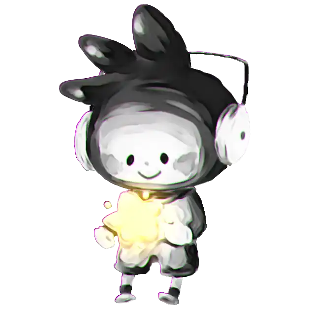
profile pic #2.2
(mar. 2023/current)
artist: larkismyname. higher quality, chromatic aberration subdued, and the star glows brighter.
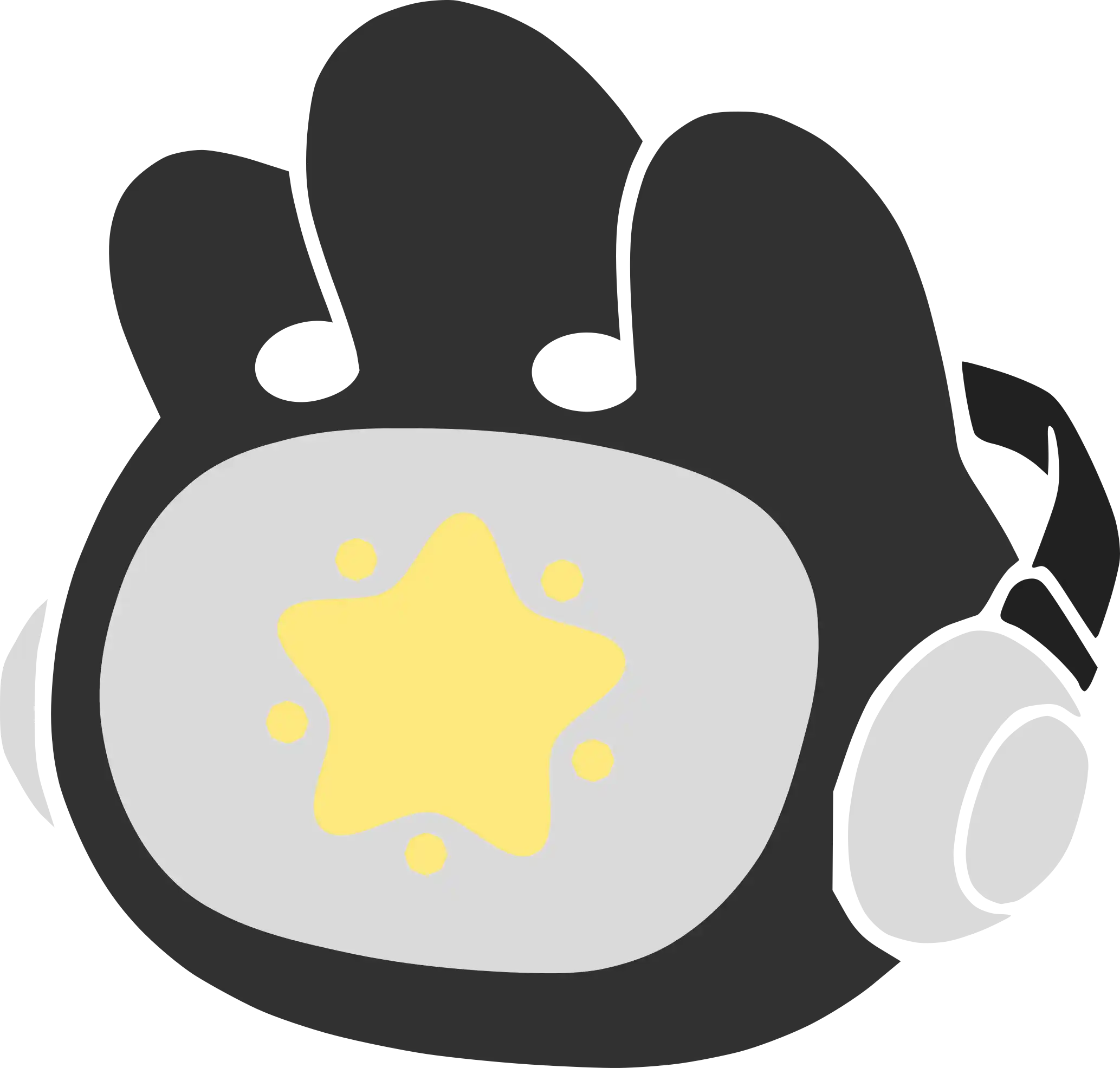
profile pic #2 (alt)
(mar. 2024/current)
edited from the scribblenauts unlimited app icon and based on #2, it was made as a parody of a record label for k.k lofi's cover art and subsequently used as an alternate design. it features a ♫ symbol as part of the hat.